Saturday, June 05, 2010

Killing Fields

These photographs from the Killing Fields of Cambodia were very difficult to work with. When Lily tried talking about it all she could remember was the pain and depression she felt looking at all the skulls. The photos are of the human remains of Juvenile females, 15-20 years old - just Lily's age group. It is unsettling, looking at these skulls, knowing that these were once young girls just like her who suddenly had their dreams, their lives, snuffed out just because of their race.

I decided to keep the layout as basic and simple as possible. No trinkets, colours or frills. Crate paper had just the colours I was looking for. Love the texture of these papers and the distressed look. Crate seems to do it especially well.

Friday, June 04, 2010

Attitude

I found some rub-ons in my stash that are still perfect! I wish I could stick to these brands but that might be easier said than done. The large capital letters are from Flair Designs and the small block letters are from American Traditional. The website for Flair Designs is not active and I cannot find much of their products for sale online. This is a real pity because the quality was good! With the American Traditional website I was redirected to another called Momenta but I could not find a good collection of letter rub-ons. Paper is all from the Mosaic Twist kit by Club Scrap. Swirls stamp unknown. Journaling on a 7 Gypsies thingy (what is it called?) that I stippled with some ink called Outdoor Denim. I bought some stippling brushes from Toy Box ages ago and they are still the best stippling brushes I have used.

The girls spent a short while on the St. Kilda beach in Melbourne. A welcome break from all the drama workshops but of course everything they were learning came into play when taking photographs! The photo with the four backsides is quite a favourite with Lily.

Wednesday, June 02, 2010

Azzurra

Tried that video thingy on Picasa with some of my favourite photos of both the kids


Saturday, May 29, 2010

Cambodia title page

Last year Lily and a group of her schoolmates went to Cambodia for a week. They spent some time in working in an orphanage and then the last three days visited Angkor Wat.

This took a while to put together because there was this one layout I wanted to copy from the current CK but I also wanted to use filigree designs. So I had to stamp the leaves, flowers. stems etc. separately then cut them out and place them on the layout. Papers are all actually from Club Scrap Key to my Heart kit but the very light shades are not evident in the scans. Stamps are by Stampa Rosa. Alpha stamps are by Gelatins. Rub-on by Fancy Pants. French curves used to make the stems.


P.S. Second attempt at trying my technique to use dried up rub-ons and it worked this time too.

Tuesday, May 25, 2010

R and R

Some rest, relaxation and shopping before heading home!

Almost everything used in this kit is from Club Scrap Bugs kit. The flowers & insects outlined with a Zig grey pen. Black outlines were a bit too sharp for my liking. The r&r title is hand written and coloured, then cut out. Art Warehouse journalling stamp. the sentiment stamp is from another Club Scrap kit - something travel related.

All inks used for stamping are Fresco by Stampa Rosa - how I miss this brand! They made the most awesome stamping supplies ever! Filigree EP, Cloisonné, Fresco chalk inks ... just to name a few. And of course their stamps were so exquisite! My ink pads are now drying out a bit and I do not have re-inkers :( Any suggestions? TIA!

Sunday, May 23, 2010

It's Not Easy

This particular drama workshop was called Physical Theatre. It was hard work! One of the courses, for example, was the Suzuki Actor Training.  By the time the class was finished the students could only think of sitting down and not doing anything else for the rest of the day!
The Suzuki Method of Actor Training develops the actor's inner physical sensibilities, builds the will, stamina and concentration. The workshop activities include a series of exercises centered around the use of the feet in relation to one's center. These exercises are designed to throw the body off center while maintaining a consistent level of energy and not swaying the upper body. The energy necessary to accomplish this task is considerable and constitutes a primary focus of this work. In the course of doing these exercises the body becomes more centered, and thus changes the manner in which the actor views his/herself within their body. This change is also related to how the actor views their work onstage. Issues such as engrained habits become more apparent as do strengths and weaknesses. By developing the body awareness of the corporal center, and a consistent level of energy, primary elements of the actor's awareness are heightened. The best and most consistent evidence of this work is apparent onstage reflected through an increasingly centered and controlled actor. (Source)

Papers and sticker are from Club Scrap Moody Blues kit. Loopy brads by Karen Foster Design. Small alpha letter stamps are by PSX. Large letter stamps used for the title are by Gelatins.

Earth Magic

Australia possesses some delightful nature parks. Here Lily is at the Kondalilla park enjoying a dip in a sparkling fresh water pool. And a very interesting Japanese theatre class was taught around a campfire.

Layout done with Club Scrap kit Down to Earth kit. All other cardstock also from Club Scrap.

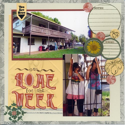
Our home for the week

The dorms at Montville, and Lily and Riva just hanging out - how much fun was it just standing on a grill door like that and swinging back and forth? The place was verdant and the students spent a good part of their time outdoors. They also had to cook by themselves and here was the fun part. Lily is quite the gourmand but can just about boil an egg. So she had to eat whatever was dished up by a bunch of sixteen year old enterprising wanna-be chefs - including some terrible pasta. But when one is young, with friends and having fun everything is easier to adjust to.

This page is done with the Club Scrap Tuscany kit (paper, border stickers, letter stickers, lemon rubberstamp). Other elements are Art Warehouse journalling stamps, petal pebbles, rub-on (you are here) by 7 Gypsies and (fleur-de-lis pattern) by Fancy Pants.  The small letter stamps are PSX.  The wavy line on either side of 'our' is a stamp by Art Baker - the calligraphy set.


How to revive a dried up Rub-On

Now here is an update on those dried up rub-ons. Fancy Pants wrote back and though they were very polite and kind, basically they told me that they had never heard of a problem like mine before (so this is happening only to me? I have sheets & sheets of rub-ons from Creative Imaginations just hanging there, mocking my crazy shopping sprees), if I wanted a replacement I had to contact the vendor (ummm ... got this over two yeas ago so who remembers...) and not a hint of a solution (I mean the problem does not exist, right, so why would they have a solution!?!)

Anyhoo, if you find that your rub-on is stuck to the backing paper then this is not for you. Those rub-ons unfortunately will have to be written off. If however your rub on is still intact, just dried out, you can give this technique a try. Do not hold me to perfect results because I have done it just once till now. I have to do this experiment a few times before I can state that it really works. While I am trying it with my dried out rub-ons, perhaps you can give it a try with yours? Better than just throwing them away. I will appreciate any feedback, tips or comments about this.

You will need US Art Quest paper perfect matte glue. Remove the backing paper from the rub on and lie it design side facing down on a hard surface. You should have the once-sticky backside of the design staring you in the face and reminding you of dollars lost. Now, dip a fingertip into the glue and gently dab a very thin layer onto the whole of the rub-on. Leave it face up till almost completely dry. It should feel just very slightly tacky to the touch. Now turn rub-on over and place it on your page (again - be prepared with some back up or cover up options if this does not work!!) and gently rub with an embossing stylus. At this point the design should stick to your page but as you can see mine was not perfect. Some bits of the rub-on just completely flaked away. Yet I was happy that I managed to get most of it on - the look is even more distressed than Fancy Pants intended it to be ... lol! I then used the same glue and my finger tip to put a thin layer on top as a sealant - just to make sure that it does not come off easily.

Bonne chance!!

Friday, May 21, 2010

Butoh

During the drama workshop in Montville, one technique that the students found interesting was 'Butoh'. It is believed to have originated in Japan after the nuclear bombs wiped out Hiroshima and Nagasaki, and other incidents of social unrest. The movements of Butoh are usually slow and grotesque. The bodies are painted white and eyes rolled up to show only the whites. All very reminiscent of darkness, decay and death. Quoting Iwana Masaki, present day Butoh involves extricating the pure life which is dormant in our bodies. okaaaay ... whatever! I do not get it. To me the whole thing just looks quite creepy ... lol!

Papers are Club Scrap fruit and Vine kit.  Large red letters are American Crafts Thickers. Photo corners are metallic and made by Daisy D's.  Little fans are cut out from a larger stamp by Magenta.Not sure where I got the sequin stamp - it is unmounted and part of a set.  The yellow strip is stamped with Kanji script and then cut with scalloped edge scissors.

Sunday, May 16, 2010

So Zen Zen Zo

All papers are from the Club Scrap Tie Dye kit. Flowers are rub-ons by Sassafrass Lass - no complaints about this brand either. They went on smooth as butter even though I have had them for a very long time. So the Fancy Pants Design rub ons are not looking good quality-wise. Plus they have yet to respond to my very polite query about the product. It has been a little over a week now. Title letters stamped and embossed - stamps by Wordsworth. Black detail Ep and ink on purple cardstock. I then cut out the letters.

Lily with her drama teachers, Zen Zen Zo instructors and fellow students somewhere in the Australian wilderness. She brought back two ugly tick bites as a reminder of all the communing with nature that the students did on this trip ;)

Saturday, May 15, 2010

Finishing off ...

Absolutely the last layout for the Ski trip to Switzerland. Put together the photographs that did not seem to fit elsewhere.

I could not get my rub-ons to rub on. So I cut them out and stuck them to cardstock. Then to emphasise them (because they were sticking out anyway) I used foam bits. Paper is from Club Scrap. Yes, those are two different shades of cardstock. The rub-on that did not, is from Fancy Pants. Good thing I bought just one! Stamps are from ... (later). About those rub-ons: I wrote to Fancy Pants asking if they knew of any way to revive dried out rub-ones. Such pretty designs! I really do not want to throw them out with the garbage. I will post here if I get a reply and if there are any instructions :). Not getting my hopes too high though.

Friday, May 14, 2010

Down Under Drama

And now - a page!! lol!! I had such a hard time finding all my supplies. I could not remember where everything was. And so I ended up using things that I found by chance - I did not even remember having purchased - like Shotz by Danelle Johnson. Or letter stickers by Frances Meyer. OMG! Those sure are dated!! I think I spent the better part of the day getting reacquainted with my supplies.  Paper is all Club Scrap.  And since this is from Lily's travel album I have left the journalling for her.  Just so you do not feel left out ;) - she went with a bunch of other students to Melbourne, Australia in 2008 for a Drama camp with Zen Zen Zo, an Ozzie Theatre group.  So they did not do much sightseeing except this one museum they visited.  Most of the stay was spent in workshops and seeing plays.

Wednesday, May 12, 2010

Mera Bharat Mahaan!

We live in a nation

  • Where a pizza delivery reaches your home faster than an ambulance or the police
  • Where you get a car loan @ 5% and an education loan @ 12%, 
  • Where rice is Rs 40/- per kg but a sim card is free
  • Where a millionaire buys a cricket team but donates nothing to any charity
  • Where the footwear we wear are sold in air conditioned showrooms, but vegetables that we eat are sold on the footpath 
  • Where everybody wants to be rich and famous but nobody wants to make the effort necessary to be rich and famous 
  • Where we make lemon juices with artificial flavours and dish-washing liquids with real lemon. 
  • Where people are standing at tea stalls reading an article about child labour from a newspaper and say,"yaar bachhonse kaam karvane wale ko to phansi par chadha dena chahiye" and then they shout "Oye chhotu, 2 chaii laao....."


Incredible India,
Mera Bharat Mahaan :)

Double Happiness card

My employer is getting married. And so finally, after a break of more than two years, I made a card. Quite enjoyed it too! I used a 'Wild Card' template from Wordsworth Stamps. Troublesome sending these cards by mail so I usually use them when I know I will be hand delivering the card. This card will contain cash - the most appreciated form of gift for any occasion for the Chinese. Any number with 8 is good but best to avoid any 4s.

I made the background using a Club Scrap stamp of two small bamboo leaves and tone on tone. The fish are cut out from a Stampendous stamp. Double Happiness is by Hero Arts. The silver embossed Kanji writing is by Sunday International - one of my most used stamps I believe :) All papers are from Club Scraps Fruit & Vine kit. Fish & Double Happiness are embossed using Chinese Red EP. I wish I had detail gold embossing powder on hand. It (gold and red) would have been more appreciated than silver and red. But after sitting there for a while all my gold ep has gone bad. Not only does it stink to high heavens, when embossed it looks almost black. None of the other embossing powders have deteriorated in this manner. And since the local RS store is quite a distance away, silver it had to be.


Thursday, April 29, 2010

Web Directions


John Allsop has data published from his latest survey on current web trends.  I for one am thrilled that Firefox is the browser of choice for most people - it is the best out there.  I am also starting to use Chrome a lot more.  I never, ever use IE!!  Check here for the PDF with all details.

Thursday, April 08, 2010

I feel GREAT!

Somehow, this after watching this video I had a very good day! The music is invigorating and the words motivated me a lot. Definitely worth the time spent watching it! Thanks to igetrealtv for some very interesting videos.

Tuesday, January 05, 2010

Avatar & Disney's Pocahontas

I really, really enjoyed Avatar!! I especially loved the story - particularly the environmental awareness message. And then I saw this and I have to say - it cannot be denied :) - the similarities in the story are striking indeed - including the initials of the hero!! I am still a huge Avatar fan - have seen it 3 times already but henceforth I will watch it with a new awareness ... LOL!

Click on image to see full size.


(Link)

Thursday, December 31, 2009

Compliants by Holiday Makers

These ridiculous complaints by holiday makers make for some very entertaining reading.
  • A tourist at a top African game lodge overlooking a waterhole, who spotted a visibly aroused elephant, complained that the sight of this rampant beast ruined his honeymoon by making him feel "inadequate"
  • "The beach was too sandy."
  • "Topless sunbathing on the beach should be banned. The holiday was ruined as my husband spent all day looking at other women."
  • "We bought 'Ray-Ban' sunglasses for five euros (£3.50) from a street trader, only to find out they were fake."
  • "No-one told us there would be fish in the sea. The children were startled."
  • "It took us nine hours to fly home from Jamaica to England. It only took the Americans three hours to get home."
  • "My fiancĂ© and I booked a twin-bedded room but we were placed in a double-bedded room. We now hold you responsible for the fact that I find myself pregnant. This would not have happened if you had put us in the room that we booked."
  • "I compared the size of our one-bedroom apartment to our friends' three-bedroom apartment and ours was significantly smaller."
  • "The brochure stated: 'No hairdressers at the accommodation'. We're trainee hairdressers - will we be OK staying here?"
  • "There are too many Spanish people. The receptionist speaks Spanish. The food is Spanish. Too many foreigners."
  • "We found the sand was not like the sand in the brochure. Your brochure shows the sand as yellow but it was white."
  • "We had to queue outside with no air conditioning."
  • "It is your duty as a tour operator to advise us of noisy or unruly guests before we travel."
  • "I was bitten by a mosquito - no-one said they could bite."
  • "I think it should be explained in the brochure that the local store does not sell proper biscuits like custard creams or ginger nuts."
  • "It's lazy of the local shopkeepers to close in the afternoons. I often needed to buy things during 'siesta' time - this should be banned."
  • "On my holiday to Goa in India, I was disgusted to find that almost every restaurant served curry. I don't like spicy food at all."
  • "We booked an excursion to a water park but no-one told us we had to bring our swimming costumes and towels."
Sources: ABTA, Thomas Cook, AAP
(Link)

Thursday, December 10, 2009

I received this in the mail today ...

and someone has even underlined some parts for emphasis!!  LOL!  Click on the image below and read on for a good laugh.